 | 9 March 2007 Link to this update Original B.net link Return to main page | << | >> |
Bungie Weekly Update
Posted by
Frankie
at
3/9/2007 5:45 PM PST
One of our effects artists, implemented some spume, foam and spray for waterfalls. The only announced waterfall is to be found in Valhalla, but it's such a pretty finishing touch and helps smooth out the somewhat abrupt collision of waterfall and river. Valhalla already feels a lot like Yosemite in some ways, and when you're standing in the fast flowing water, up to your thighs in it, the effect is complete. Maybe just a little more alpine and open than the national park's intimidatingly oppressive grandeur.
We also added splashing for bipeds (Spartans and other characters) walking through the water (they already ripple it when standing in a low or moving through it) and significant spray when vehicles drive through it, bordering on a rooster tail effect, although we can't make it too crazy, or it will spoil your sniper view of a fleeing Mongoose driver.
Hyper Sniper
Now, speaking of sniper view, I noticed that weapons laying on the ground looked considerably better all of a sudden. They just seemed to pop more. So I asked a grown-up in this case Tom Doyle, one of our amazing 3D artists, who concentrates primarily on weapons these days and he had in fact made some big changes.
So textures had another layer of improvement, and the overall model quality had improved but importantly, on weapons a cube map had been added to reflective surfaces like metal which is basically a 'cheap' way to add realistic reflections to surfaces so the reflection is real roughly the area the weapon is in, but doesn't hog processing power by having to be rendered for every single frame and location on the map.
Anyway, the upshot is that the weapons look way better in your hands but remember I was saying they popped on the ground? Well that's an aesthetic trick. The model is actually slightly bigger in its 'ground' state, so that you can see it more easily. I don't mean super jumbo it's a subtle thing, but it makes a huge difference.
Jub Jub and Co.
In multiplayer play tests, we moved back to a map we hadn't played for ages codenamed Jub Jub, which still hasn't had any graphic polish, but did get some revamped geometry. It's what I'd call a smaller map, about the size of Lockout and with similar layering of geometry lots of places to hide and drop down from - but it had seen a few navigation changes since the last time we played.
We were testing territories and I have to say, it worked great. There was no way to easily hold a territory, and even players fighting for other zones, could at least lob grenades it you to interrupt your capture progress. It worked surprisingly well, but the map is also going into its scheduled graphics tartup phase, so my Jub Jub codename will either be enhanced or rendered meaningless.
Those geometry changes on Jub Jub also took out a gap by a ramp that I used to abuse, so now I sucked at it (more than normal).
But it's not just old Halo 3 maps I've been playing, I tested a little bit of a couple of Certain Affinity's new Halo 2 maps. I wish we could share more info about those, but right now isn't the time. It'll be soon though. I think hardcore Halo 2 players are going to LOVE this stuff. One of them is going to be the ultimate BR nastiness map, so SWAT and MLG-style players will have a ball. Everyone else can play that map with kinder, gentler settings and love it too.
The wind effect on the grass decorators has had some work too. It now blows in a convincingly non repetitive fashion. Before it got some of that polishing loving, you could easily see the pattern in the way the 'wind' moved through it. Now it seems to be obeying a natural breeze. Combine that with a lovely audio scheme (which varies by level) and the illusion is complete.
DOF Cap
Now I keep discussing this stuff as if it's photo-realistic. And sometimes it is, but again, from an artistic perspective, we've gone to great lengths to make sure that the new game retains the 'Halo' aesthetic. It still looks like a Halo game, but just rendered with vastly more detail and content and some visual effects that simply weren't possible on Xbox. And part of that aesthetic is directly tied to gameplay. I was reading about DOF (Depth Of Field - the appearance of something being in or out of focus, as seen by a camera lens, but designed to emulate human vision) effects in another game yesterday - and thought about some of the ways that can harm and help something like Halo.
As a matter of fact, we do have depth of field in the game, but right now, it's only being used (with any great visibility) in the UI and in cinematics - because one of Halo's key functions is the idea of long distance combat. If something is out of focus for the game engine, that doesn't mean the player wasn't trying to focus on it.
We would never implement something in multiplayer that artificially obscured the player's ability to decide what he or she was seeing. There are borderline cases though. When you run around in a dark area - the bunker in High Ground for example, and then dash into the sunlight - your 'eyes' will adjust to the glare with a subtle blow out of the sky compared to the rock and dirt directly ahead of you. To 'see' the effect happen, you'd have to stop, look up and wait for the sky's contrast to adjust (about a half a second) but it's there.
However, it deliberately doesn't obscure your vision. It's just a subtle trick to fool your brain into thinking you've been inside for a while - the same effect you get when you emerge, blinking, from a movie theater into daylight.
In the UI however, we go nuts with it. Primarily to make elaborate 3D backgrounds that aren't too distracting in comparison to the usable portions of the UI. It's a lovely effect. You'll definitely see some of that in the public Beta.
Splitsville
As for multiplayer - a couple of games were announced or released this week with no split-screen. My mailbox instantly filled up with angry complaints about how Halo 3's lack of splitscreen multiplayer was an affront to mankind and that I ought to be shot in the face with various impossible guns and mangling devices.
Well I make no apologies for Halo 3's lack of splitscreen multiplayer, primarily because it WILL of course have splitscreen multiplayer. That's a vital part of the Halo experience and one vastly improved by the advent of high def TVs. Basically with a big LCD or plasma, the splitscreen experience takes on almost luxurious overtones.
There are several tiers of this multiplayer mode. At its simplest level, it's a couple of siblings running around on Lockout with swords. But at its most convoluted, it's a LAN party where adding TVs keeps blowing out the power (we say this from personal experience) and splitscreen at that point, is a godsend.
We'll still have the same online matchmaking restrictions - not being able to play splitscreen in certain types of ranked games, for example - but otherwise expect full feature parity with Halo 2 in that regard - with some improvements based on resolution and evolution (including improvements to the HUD.) to make the game easier to see in those modes.
Don't worry standard def owners, we're making sure it looks amazing on your sets too. In fact, our test department still has as many little 4:3 CRTs as it does LCDs.
In a couple of weeks, we're switching over to the redesigned Bungie.net, the result of a lot of hard work and effort by our web and art team. It's a cleaner, prettier site in many ways, and it certainly addresses a lot of the complaints you guys have about navigation and clarity. However, you should remember that for a while after the relaunch, some of the features you're used to will be moved, or in the case of groups, temporarily on hold. If you want to guarantee your groups pages come back as normal, then we suggest backing up your data - even if that simply means cutting and pasting text, or saving the entire set of pages as html - that's because it's possible that there will be some data loss by the time groups return. Of course, we'll do everything to ensure that isn't the case.
Added March 10, 2007

This is an early glimpse of the new site design. Gaze in wonder at its navigable glories.
Shut It!
So remember we were explaining how easy it is to mute an annoying player a while back? Well it's even easier. The interface changed a little and Dave Candland took me through the process. On my first ever try, I muted Dave in less than a second. This is the process as it stands now:
- Annoyed by player
- Press BACK button
- Right stick to select annoying player
- X to mute
Now, the cool thing is it keeps your hands in place for battle, so that it's less likely you'll get owned as you pop back out of that mode (you can still see what's going on in the game during this brief pause). You can also look at who is actually talking in that screen (the mic icon will be 'lit' up, and if you want to un-mute them, the process is exactly the same. The X button un-mutes a previously silenced player. Better still, it looks like the option to turn off proximity voice on opposing teams is in. So you can choose whether to hear them or not, but still hear your friends and teammates speak while in proximity. Really, there are layers and layers of tools in this regard, so you should be able to fully customize voice to suit your needs.
Philosophically speaking, however, this can turn bad players into good players. After all, if you can't hear them spouting drivel, then it's effectively the same as playing against a good sport with his mic disconnected. That should mean fewer sessions quit in frustration and lots more happy matchmaking scenarios. It might even provide a little social training for some of our less sophisticated friends.
And guys, that is not the 'true' function of the X-Button, before your panties start autobunching. The X-Button in-game does something else. Something neat. Although technically yesterday, the testers complained that because something had been turned off during a performance test, pressing X caused their game to crash, and you could hear them all yelling, 'WHO PRESSED X!!??'
Anyway, no Mr. Chief thanks to the power cut, but if it's working in the morning, I will get that image and a screenshot of the new website up for you.
Added March 10, 2007
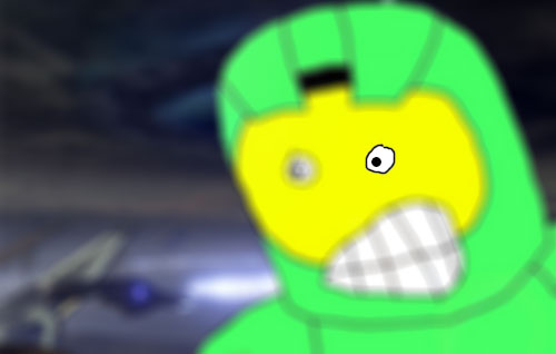
Anyway, here's yesterday's powercut delayed Mister Chief. See, it was sooooo worth the wait. Mister Chief with too much Depth of Field.
